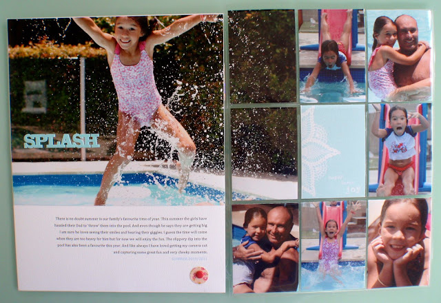
I really liked the layout of this magazine article.
 Clean and simple, with lots of room for photos, patterned paper and text, as the requirement may be to tell your story. A double page with some oomph.
Amy whined, and moaned, and grumped about this page. Told me it was too hard. That her page was just awful.
And then I got it in my inbox, and how GREAT did it turn out!
Mine, well you know me and pages, they sort of end up making their own direction.
 As usual, not everything went to plan, and the printing didn't work how I wanted to, but not one to muck about too long (after all the story is told, its just something about the text margins or spacing that is bugging me) but its done, in the album and ticked off the list!
I find double pages quite hard to photograph. Please do excuse the pegs (but hey! solved my problem!)
Nicole had a page that already followed the same basic premise of the magazine layout, but mirror image.
Di's version, using divided page protectors - I love how it turned out! and great focal photo.
Emma has been flat out with a new job and chasing around her kids, so she is going to link hers up when she gets a chance.
Anyhow, will keep it short and sweet, as I am in the far west of the state in Cloncurry at a field day. Gotta love modern technology!
Anyhow, will keep it short and sweet, as I am in the far west of the state in Cloncurry at a field day. Gotta love modern technology!


Yes, I freely admit, I certainly pouted when Sharon came up with this idea! I am not a fan of the double pager ... but, it solves getting lots of photos added to the page!
ReplyDeleteGreat pages Saggy girls :-)
And I was very late but love how everyones pages turned out :)
ReplyDeleteI think it's a great design, and the different interpretations are all inspiring me! Off to give it a go. :)
ReplyDelete