Monday, June 25, 2012

Week Nine | Kraft

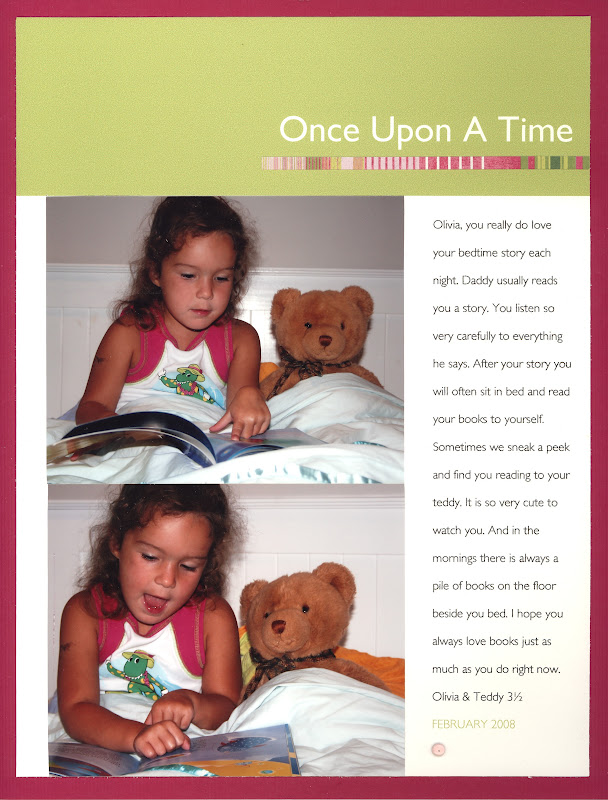
After the challenging week that was Week Eight and the Black and White theme, we are moving on to the easier, and more prevalent neutral, Kraft.

White, Nightmist and Kraft are my most commonly used Bazzill colours - I spent a lot of time searching through digital shops to find the equivalent and have come across some at both Designer Digitals and Oscraps.

My first layout is based on a design Sharon came up with, it was taken from a magazine article if I remember correctly.


This next page is a Cathy Zielske template.


Have a great week, I'm looking forward to seeing what the girls all come up with this week - I have a feeling Kraft is not in short supply!

Friday, June 22, 2012

Black and White


Black and white is quite tricky, and it looks like several of the other Simple girlies had a hard time coming up with something. No worries girls, some weeks, it just doesn't happen! So here are two b/w based layouts. Both fairly old! Hope you like em.  I like the first one the best, but the second one was published in Creating Keepsakes once upon a time.

Monday, June 18, 2012

Week 8 | Black and White

Now this week was hard. It wasn't hard to find a layout with a black and white photo, that would be cheating, but it was hard to find a predominantly back and white layout.

I had to search the archives, I've had a new layout for nearly each week up until now .... my excuse is that I had to make three birthday cakes last week, and they were all for the one person.


Gotta love U2. I didn't get to see them last time they were out, actually, I've only seen them once in concert and I'd love to see them again one day.

Black and white; any pages to share?

Sunday, June 17, 2012

The Last Blues!


I just realised that I'm 3 days late with my blue layouts. A layout for each late day!  The first layout uses no blue cardstock at all, but is still very blue! The middle layout sits on an 'admiral' blue bazzill cardstock. The last layout is using my favourite cardstock colour ever, 'Whirlpool'. Some people might consider it in with the greens, but I think it says more 'blues' to me. Though it's definitely debatable? What do you think?
Nicole x

Wednesday, June 13, 2012

how many song titles have BLUE in them?

I have no idea, but two popped into my head straight away..

ANYHOW: on with the show. Blue. Obviously a popular colour with the Simple Girls, and I seem to use it a lot as well. Love me a nice strong navy blue, or a washed out more denim like I have used today, its a very versatile colour.

IMG_3852Another one of those that don't get any simpler, with not one jot of patterned paper anywhere! Created using a CZ template, printed at home and dropped onto some heavy doublesided blue paper (there was an awful pattern on the other side, but I like this plain, linen like blue). Some brads and done.

IMG_3854I could have gone the smaller 8.5x11 size, but I love the white space and the expanse of blue on the double page. It just looked so busy in the smaller page format.

Don't be shy folks, we would love to see your own pages of blue, or green or orange or yellow etc, you know the drill, just leave a link in the comments or upload to flickr, just make sure to tell us!

Tuesday, June 12, 2012

Blue...my favourite!

My favourite all time colour is blue...I scrap with it, I wear it, I decorate my house with it! So of course I have many layouts that I can show you. But I'll pick just a couple.

I too am a nightmist fan...it is my go to background colour (second only to white!). Nightmist looks so great with so many colours.


Next up, I have gone a little digital! I created the template of a bunch of squares, added the photos and then I actually stuck bits of patterned paper in the squares with no photos (as I'm not a digital scrapper, I didn't have any digital paper to use). It is rare that I don't include any journalling, but for this layout I didn't really need to say anything. It was just a good way of scrapping a bunch of random photos from the Summer without having ten layouts on the same topic!


There are so many other Blue layouts I could show, but I'll leave some more to the other girls!

Come back tomorrow to see some more blue.

Emma

Monday, June 11, 2012

Week Seven | BLUE

Hi everyone, it's a public holiday here in my part of the world so I am going to be very quick.

I love blue.
Simple.
My favourite Bazzill colour is Nightmist ... wooohooo, I can name a colour of Bazzill, pity I don't really use it any more.

If I look back over all my layouts, blue is a predominant colour, by a long way; closely followed by green. So, this is an older page, but is uses both blue and green and is one of those random pages I am really glad I have. It's a digital page made with a template based on a layout by Beth Proudfoot from the old Simple days, she's one of my favourite designers.


Next one is a new one. 12x12 in size and using a blue digital cardstock and a brush, along with some green, well, it's a yellowy green.

 
I have a feeling that there might be quite a few pages going up this week, blue is a fairly popular colour here at SAG!

Sunday, June 10, 2012

inspiring orange...


Pinned Image

Pinned Image


Pinned Image

some great orange colour schemes, love them all! Accent colour or using it holus bolus, its just so cheerful isn't it!

Stay tuned for the next colour coming your way this week, can you guess what it is?

Friday, June 8, 2012

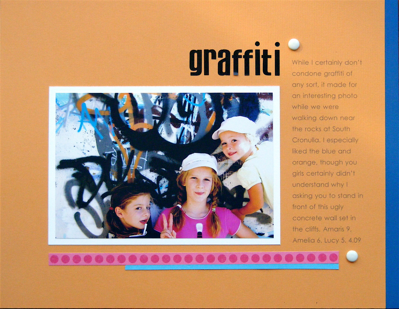
Some orange (and some graffiti!)

The end of the week of orange.  I love orange, though I have no idea why? I don't like it hugely in real life, but I love it on scrapbook pages.  Just this minute, I have put together a paper layout so I could share it with you. It isn't as blatantly 'orange' as I thought it would turn out, looking at the photo, but there is certainly some orange going on! Here it is, hot off the press.


On browsing through some older layouts this morning , in the hunt for orange, this one jumped out at me, purely on it's 'orangeness', and coincidentally, happens to be running along a similar theme to the layout above!


(And here's another photo, waiting to be scrapped.....do I have a graffiti issue???)


And do I want to go to this place below? Um...gasp...yes, please?? Sadly I can't, as it's been closed to the public (not that it was ever opened to the public, it was just an abandoned depot, which is now guarded by several large and apparently very aggressive rottweiler guard dogs!)


(Photos by Susan Clark and William Cowan respectively)


Anyway, I have been distracted, and will now return to orange! Will throw you a couple of OLD yet favourite orange pages, these being 12 x 12, a size which I no longer scrap in. I'm a 8.5 x 11 scrapper now, due to it's speediness and ease! These layouts below have some Ali Edwards influence which that circle word stamp - must dig that up out of my supplies!


See you next week, for a new colour of the rainbow, from which to be inspired!  

PS. Apologies for mid post distraction!


Thursday, June 7, 2012

green...purple...orange...

Oh So sorry for being such a bad blogger the last few weeks. No excuse...just a make up pos.

I have to say looking back for pages to fit the weekly colour has been a lot of fun and is motivating me to 'get scrapping" again :) And reminded me it's not about the design just the 'words & pictures'. I am going to spend some time simply re-using many of my own pages.

Green.

Now this is something I should do every year...funny reading my likes and don't likes...it could be today not 5 years ago!


I LOVE green and pink together :)

Purple.


Orange.


How funny does hubby look ... hehehehe!


Sadly...she no longer holds the pencil this way...bloody school!!

I PROMISE I WILL NOT MISS NEXT WEEK!

Diane

Wednesday, June 6, 2012

oh so lovely orange

I like orange. I scrap with it more than I thought I did, it is quite a versatile colour, very much like green.

just add mud 1

just add mud 2

A fully digital paper (you may notice that the paper is the same as Amy used on Monday) printed out on photo paper at home, I will mount on some kraft I think and of course I will have to whack a brad on there in front of the title.

This layout takes photos from  a years worth of swimming, mud and water play. There was a LOT of them :-) And its nice to see how the faces and hair have changed during that period of time!

Tuesday, June 5, 2012

More Orange

Ok, so this week was a bit easier for me. Whilst Orange is certainly not a "go to" colour for me (bring on Blue week!), I do use it a fair bit...probably more than I would have thought! It seems to work with a lot of photos. Funnily enough it is not even a colour I necessarily like!! Yet it works well sometimes, so I still use it.

Anyway, this is a layout I did recently. I must apologise for the photos, I had to take them at night time, so the light was bad! Love this sketch, I use it often.


This next one is really old layout, but I wanted to show it to mention that I LOVE teal and orange together!!!


Thanks for reading! Have a great day.
Emma

Monday, June 4, 2012

Week Six | ORANGE

Well, have a look at this .... I used patterned paper!


I'm not getting the stories down that I want to at the moment, it's frustrating. Sigh.

Have a great week everyone, bring on the orange!

Friday, June 1, 2012

Purple on Friday

The last day of our purple week!

I like purple, and like when I do purple layouts, but I have very few. I have very little purple paper for some unknown reason, and always have to scrounge into the deep depths for purple cardstock scraps or patterned paper. I really have hardly any. Purple seems to have been a challenge for the other Simple girls too.

But today I have, shock and horror, a NEW layout for you, taken with my current favourite type of photos, 'Instagram'!


And here is an old 12 x 12 layout that I still haven't put a title on - only 3 years late. Planning, one day, to have a title in white thickers across bottom right hand corner of main photo. Call me lazy. 


This last layout is really really old, about 6 or 7 years, but I love this layout, as it uses 4 photo (one odd shaped) and the colour combo was Cathy Z inspired.  Would do a slightly brighter green if I were to do it again, but it's still one to look back on and be happy!


See you next week!

Wednesday, May 30, 2012

red and yellow and pink and green...PURPLE

I guess you've worked out the sequence of events around here by now?

my take on purple, in which I delved into the archives and found some purple pages from when the girls were little and oh so cute...look at those little chubby cheeks...awww.

IMG_3787love the simplicity of this design, although it doesn't allow room for saying much, but sometimes not much has to be said. Seeing this page reminds me of how that little one used to plonk herself in that bike and hope that her sister would come along and take her for a ride....and I love that paper. Think there might be bits of it in my scrap drawer still.

IMG_3789here is a bit more of it on the next purple page, with even more brevity of words :-) That cake was a true masterpiece from my kitchen, double iced and all. Flowers were from my garden. That plant has long since died. That kid is still a ratbag though, at two she was just hitting her straps.

Does looking at your old scrapbook pages, or even your photo albums, send you on a trip down memory lane? Funny how one photo strikes a memory chord, which leads one off on a tangent and one ends up in a completely different place than from where one started....

Related Posts Plugin for WordPress, Blogger...